Creative Concepts
Tesco ditches its logo in bold new outdoor campaign
The campaign was created by BBH London

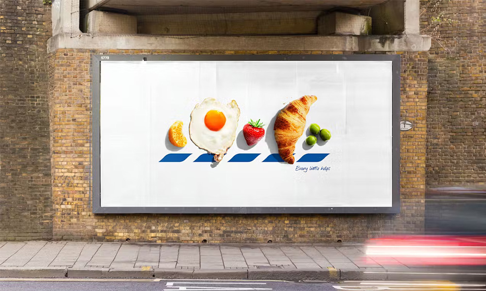
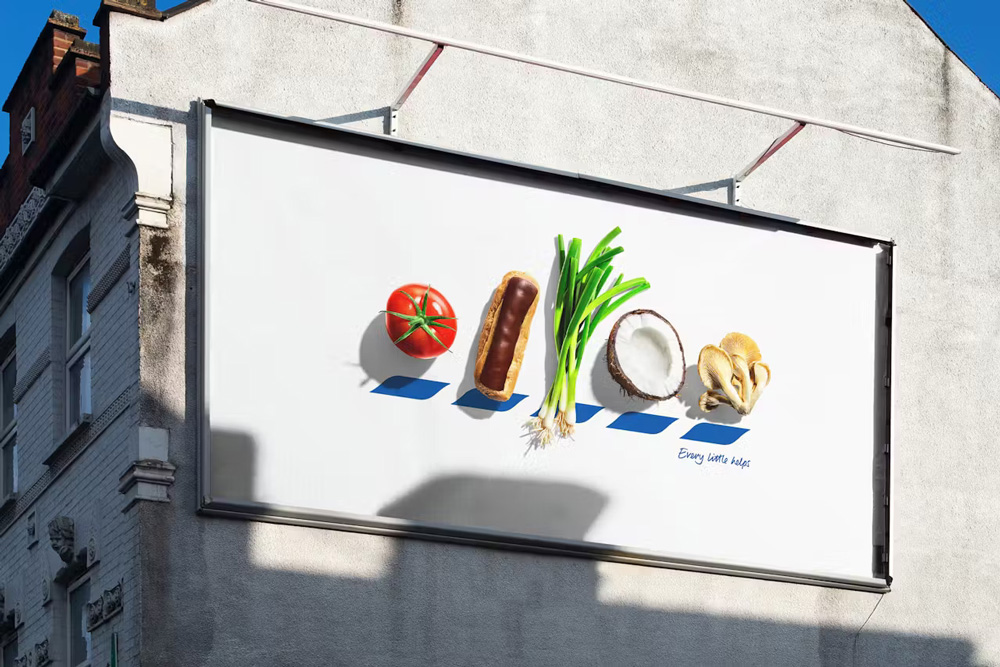
According to a report by The Drum, in an audacious new marketing stunt, Tesco has peeled away its iconic branding, opting instead for a food-first approach. The British supermarket giant has launched a new outdoor advertising campaign, titled “Icons,” that places everyday food items front and centre, effectively replacing the letters of its name with artistic food photography. While Tesco’s famous chevron motif is still subtly present, the brand’s primary logo has been completely removed, allowing the food itself to take on a starring role.

Created by BBH London, the campaign demonstrates a level of confidence and brand recognition rarely seen in traditional advertising. Tesco’s chevrons, a visual marker that has long accompanied the supermarket’s logo, are considered recognizable enough by the agency to carry the brand on their own. This bold move shifts focus away from a conventional logo and directs attention to the vivid food imagery while still featuring the familiar “Every little helps” slogan, ensuring customers can still make the connection.
![]()
By removing the logo and replacing it with food, the campaign reflects Tesco’s confidence in its brand equity. BBH London has leaned into the idea that the supermarket’s association with fresh food and familiar slogans is strong enough that even without a traditional logo, customers will immediately recognize the brand.
Photo credits: The Drums
-

 Campaigns
PDSN Media executes SBI’s turnkey branding takeover on Metro Aqua Line 3
-

 Campaigns
Muthoot Finance’s “Sona Kya Nahi Kar Sakta” OOH campaign
-

 Creative Concepts
Nykaa turns Mumbai’s Carter Road into a sun-care playground
-

 Creative Concepts
KFC builds buzz in Vizag with a towering sand bucket activation at RK Beach


